I’m trying to achieve this kind of design with Flexbox : https://dribbble.com/shots/1824902-Manual-Magazine-Blog-Content-Layout
I have a problem handling the heights of the boxes.
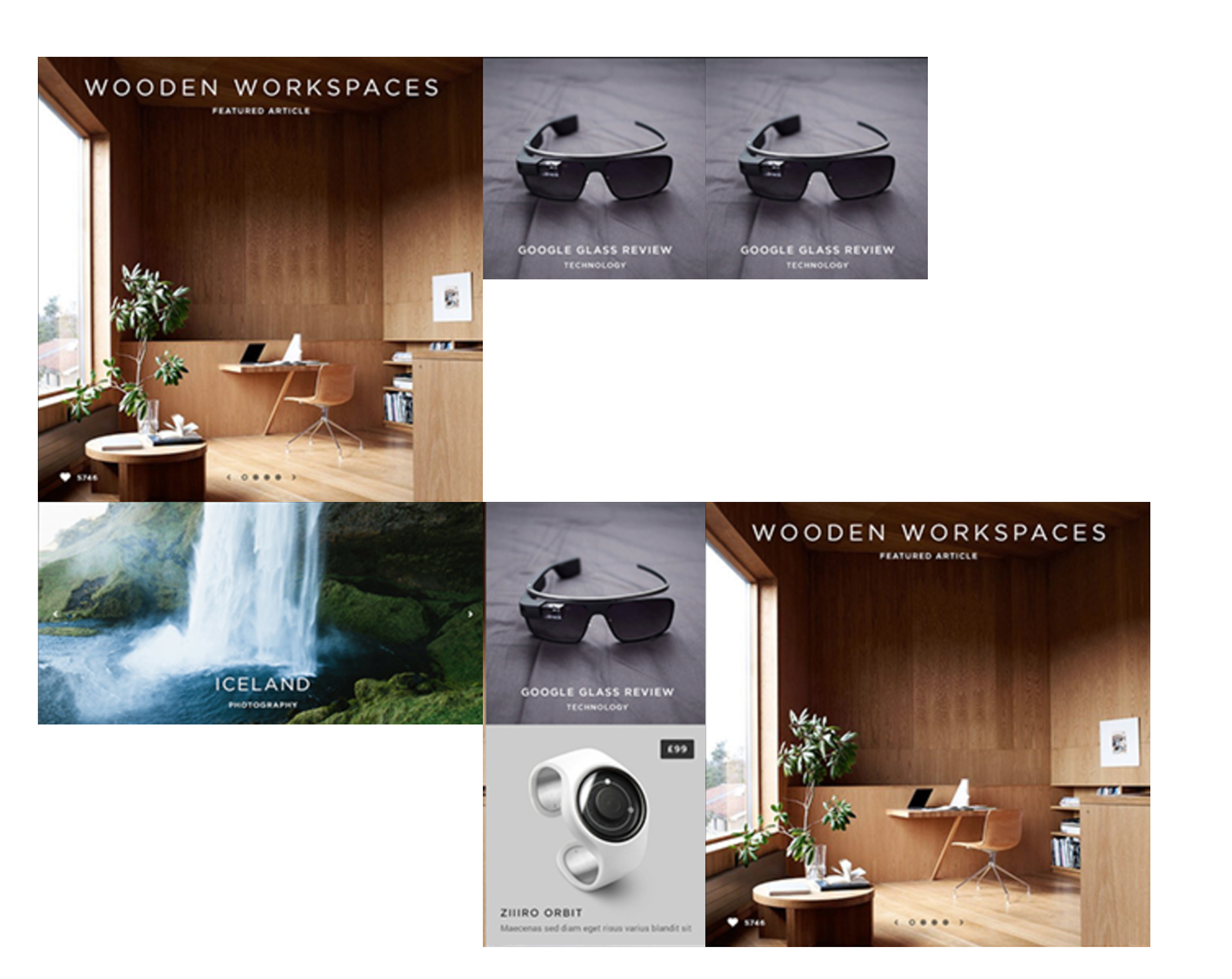
Let’s say the “Wooden Workspaces” box is 40% width and 40% height. The “Google Glass Review” box is 20% width and 25% height. I’d like to have two “Google Glass Review” boxes that are in column (like on the design “Google Glass Review” and “Ziiro Orbit”) but when using Flexbox it puts the boxes next to each other.
I followed originally this Flexbox tutorial : https://flexbox.webflow.com/#fluidgrid
This is my Flexbox div style :

“Google Glass Review” Upper box :

“Google Glass Review” Down box :

Any ideas on how I could do this ?
Thanks in advance !
Antoine
Here is my public share link: https://preview.webflow.com/preview/antbell?preview=38e71a1f788a3aba46e715302e403c05
(how to access public share link)
 I’m glad to help.