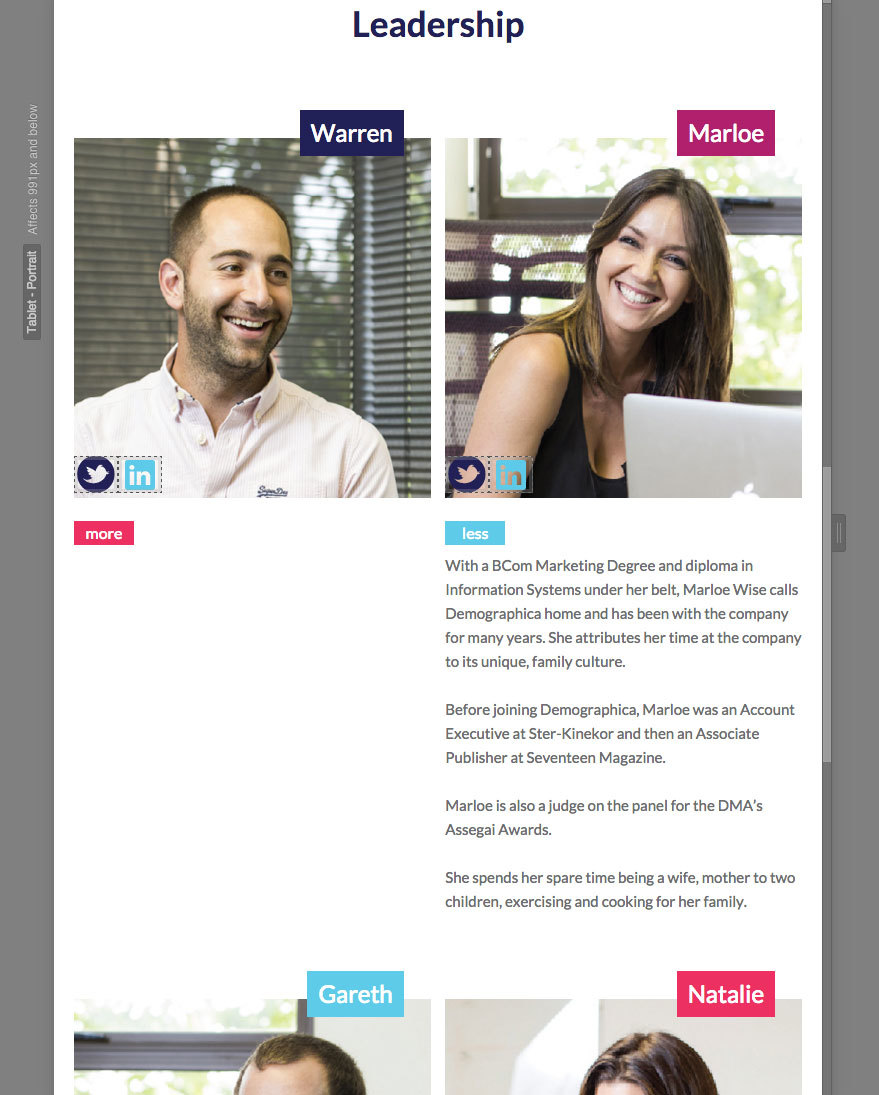
One small thing is that the column blocks stack badly in the “Leadership” section when the collapsable “more” button has been clicked and it’s associated text revealed. I’m sure it’s a “position” issue but being new to this, I thought I’d reach out.
Marloe pushes the other blocks down which is correct but Warren does not. Gareth pops up adjacent which shouldn’t happen. Images below…
I got it to work by nesting the columns within another set of columns so that they clear properly.
So I created 2 columns and then nested 2 columns in each single column. Then when you go down to tablet view you just set the top 2 columns to a single column in the responsive settings. Giving you two rows of 2 columns at tablet view which clear properly.
Not that I know of in webflow. Would probably need access to the code which you can’t do in webflow.
Another option might be to build the profiles of the people in an unordered list instead in the same way that webflow works in it’s CMS. As that should give you more control in theory. So might be worth a quick try.
Alternatively, wrap your content inside each column in a div, and adjust it’s padding.
I got it working nicely in the read only version as a list. Takes a bit of work, but with floats and a few adjustments on the media queries and end columns it’s possible.
Unfortunately webflow only lets you work in a read only view on other people’s shared links. So here’s some screen shots of the structure and at different sizes.
I gave the list items a class, and then the second and fourth items both got an additional class each for the adjustments in the media queries necessary.
The columns need to add up to 100%, so first decide on the gutter width, which I did at 2%, and then minus the gutters from 100%. So that leaves you 94% as there’s 3 gutters. Then divide 94% by 4 columns = 23.5%
I also Floated it left and set position to Relative and added 5% margin at the top
On the last column with the sub class I adjusted the gutter back to zero.
In tablet view you have to adjust the widths again. So as there’s 2 columns there’s only one gutter. So 100% - 2% = 98% divided by @ cols = 49% each column.
Then at mobile landscape view you’ll probably want to go to a single column layout. So change the width of the main list item to 90% and give it 5% margin left and right and more at the top as well.
It’s not ideal, but hopefully that should work better for you.