Hello! I’m new to Webflow, but am having problems with the smallest width mobile screen. I was able to adjust everything in all the other mobile sizes.
- How do you decrease width of modules/paragraphs/videos?
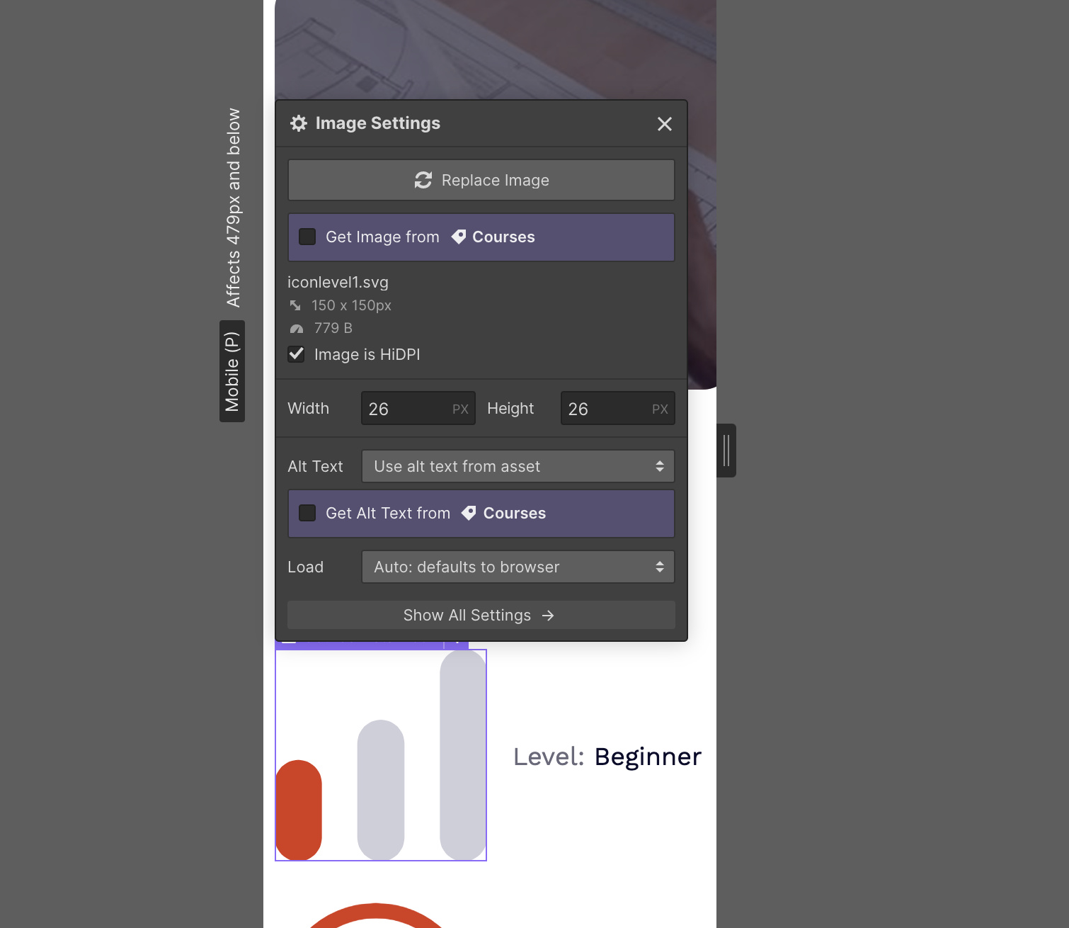
- Why can’t I decrease the icon size? I click on the change icon and it says the width is 26 by 26 - just like the other icons.
- Also why does the nav bar have to look so wierd in desktop in order to look normal in mobile? I am using an image for our logo.!
Screen Shot 2020-09-04 at 9.50.55 AM|576x500


Thanks in advance for your help!
Here is my site Read-Only: LINK
https://preview.webflow.com/preview/mtcopeland-886ce6c566450917dffbb118923b?utm_medium=preview_link&utm_source=designer&utm_content=mtcopeland-886ce6c566450917dffbb118923b&preview=c72d66a027604f54cac9d9f3596ec3fa&pageId=5f5126ddd06cb0a5e03141da&itemId=5f5126ddd06cb01f3c31422f&mode=preview
Here is my site Read-Only: LINK
(how to share your site Read-Only link)