I’m trying to serve high-quality images with “img” tag on mobile without luck.
Please, check this link from your mobile: interludio.webflow.io/case-studies/barrachina-gestio
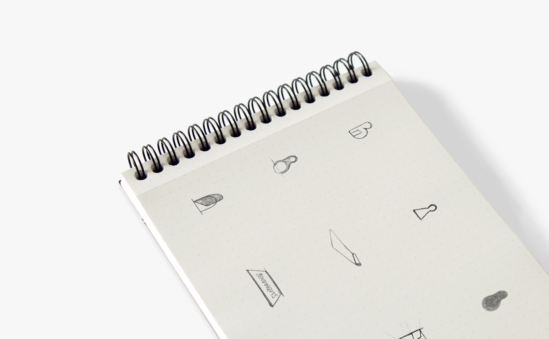
First two images of the page with the notebook: the one on the top is an “img” tag with Responsive Image unchecked. The second one is served as a background image.
I would like the image on the top served with the same quality as the one from the bottom.
Here is a screenshot of what I see from a mobile phone.
Inspect element by chrome. Image1(top) and the image2(bottom) are with same dimentions/size: image as img (img tag | 1890 x 1168 | 87kb) Image2-link-bg (bg css | 1890 x 1168 | 87kb)
As BG or img tag - not change the Quality of the image
If you want responsive image - check=true this feature (not as “unchecked”).
Anyway its hard to 100% understand what is the problem. Maybe add more detials.
What do you mean when you saying “same quality”
Try this (custom CSS). Again this is an issue only beacuse the pencil strokes (very tiny detials) + scale down the image by the broswer (2X, 3X down)
