How to hide elements on some breakpoints without deleting the element completely

In regards to responsive design, I noticed if I delete a button (for example) in a lowered tiered device like phone, then it also affects the change on the higher tiered devices like ‘laptop’. I thought responsiveness was suppose to be cascading downward only.

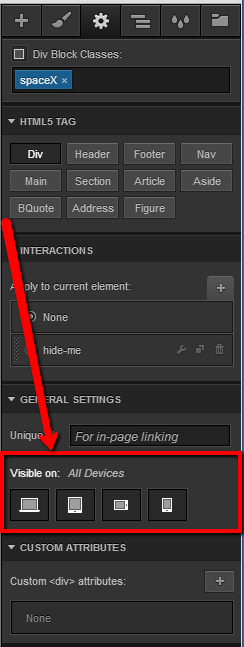
Is webflow’s responsive design only limited to “style” changes like color, size…etc? If so is there a way to present slightly different content elements in different devices using webflow?

In other words for example I would like my secondary navbar NOT to appear on all phone devices…etc.

Thank you

if you want to hide/show certain elements, depending on the viewport size, just use this handy feature in the settings tab:

2 Likes

Awesome! Now what if I want to change the size of my columns based on viewport size?

Select a column element, go to it’s settings and you will see options for each media query.

I did that and I’m not seeing any available options under different devices? I only see options for ‘Desktop’.

You should see something like this:

Currently we limit how customizable the columns are for mobile and down but we will be making it a lot more flexible in the future.