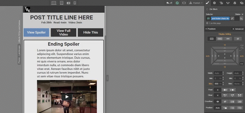
Hi, and welcome to Webflow! The best way to deal with tabs is to use percentage widths. So for 3 tabs, I like to do 32% width which will add even spacing between them as well. You can fiddle with the percentages while working. Also keep in mind not to select the active tab because you will be styling only that one, you want to style the inactive tab so that the style cascades down to the active one as well. Hope that helps.
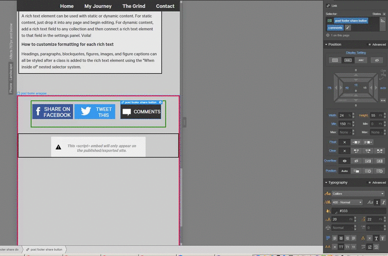
Hi @TravisBKlein, I took a quick peek, and it looks like the share buttons on mobile landscape are set with display inline block and float off. I would suggest to change it so that the FB and Twitter share buttons are set with float left, and the comments button to float off.
Then to center those, select the parent post footer share div, and set that to a width of 84% to center the div on the page.
Hey @cyberdave, I did that but the 84% makes the div not large enough and it pushes the comments one to the bottom:
I just put relative offset of 13px on the comments one to push it up, but wish I knew why I needed to do that if they are all set to inline block, no float.
It seems like you got it to not drop into the second row. You still have a 2% margin on both the inactive, and the active tab. I’d remove both of those, and add a 1% margin to both sides of the inactive tab. It pulls to the right because you have the margin only on the left side. I’d also remove all the positioning styles to the active tab except for the color change/active state look that you want.
I got the comments share button to line up only because I added an awkward 13 pixel positioning to it, which I just don’t understand the reasoning for it, like why it isn’t just lined up without the 13 pixel change.
I mean I’m totally cool with the 13 pixel offset just kinda confusing ya know.
AHH the tab buttons yea that did work perfect and I should of thought of that about evening the margins to match eachother instead of just playing around with what could work. Thank you @DFink!
Sure, let us know if you need anymore help and welcome to Webflow! Also, if you haven’t already, I strongly recommend working your way through watching all the videos over at http://help.webflow.com/courses and on Webflow’s Youtube page. They seriously helped me master Webflow when I started in just a few hours! Good Luck!