Is it possible to add a stroke to text like this. I want to make an editable cms title so that it would display as seen in this screenshot…
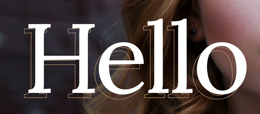
Is it possible to add a stroke to text like this. I want to make an editable cms title so that it would display as seen in this screenshot…
there’s a tutorial for creating knock-out text (the sort where it looks like text has been cut out of an image) somewhere. Should be able to use that for this sort of effect as well? Or create two versions of the text, one styled like the full white ‘hello’ and another like the outline? Put them on tom of each other with position absolute?
Yes. I did it for this:
http://stranger-things-title.webflow.io/workshop
Here’s the custom code:
.letter {-webkit-text-stroke: 3px #c11b1f; color:black !important; -webkit-font-smoothing: subpixel-antialiased;}
Thanks @sarahfrison! I did a little raccooning around on the web and I found some code. It works perfectly…
<style>
 .outline-heading {
	-webkit-text-fill-color: transparent;
  -webkit-background-clip: text;
  -webkit-text-stroke: 1px #B79170;
  }
</style>
Killer. Thank you 
Hi @PixelGeek I’m trying to create the same effect here but when I add the Webkit code into the page header tag the styles are marked red and don’t seem to go through - any idea why this might be the case? Is there somewhere else I should be putting them?
Screenshot here for the current css I have placed.

Mine are colored with a red background also. That seems to be new. However, the effect should work. You have opening and closing style tags right? Also double check you have your text element spelled correctly.
@spoulos thanks for writing back! I figured it out - the issue was that one of this headings parents had a defined text color that was overriding the custom CSS. Silly mistake, but being a beginner on the custom code side, I assumed it was an issue with what I had written and not the general styling/hierarchy of the layout.
Thanks again for the reply!!
Jn
Thought I would drop some code here of a smother stroke you can use with text shadows.
Add the tag “outline-heading” to any text you want to apply the effect to.
<style>
 .outline-heading {
  -webkit-text-fill-color: white;
  -webkit-background-clip: text;
   text-shadow:
    -1px -1px 0 #000,
     0   -1px 0 #000,
     1px -1px 0 #000,
     1px  0   0 #000,
     1px  1px 0 #000,
     0    1px 0 #000,
    -1px  1px 0 #000,
    -1px  0   0 #000;
  }
</style>

Enjoy!
Where do we place this code to achieve these effects?
How would you solve the contrast error that occurs when you are setting the font color to black, on a black background?
If you’re trying to edit the stroke of some text you can use this visual css stroke app we built!
It’s easy to mockup your text and copy the code right from the ui.
code output:
  <style>
    .text {
      fill: #0b9193;
      stroke: #813131;
      stroke-width: 2px;
      stroke-dasharray: 4;
      stroke-dashoffset: -25;
      font-size: 74px;
      font-weight: normal;
      font-style: normal;
      font-family: Arial;
      text-transform: none;
      text-decoration: none;
      letter-spacing: 0px;
    }
  </style>
For anyone stumbling across this, it’s now possible in the designer.

Happy stroking.
Yeah, that sounds weird.
